situ_ui — the component kit
A dense-enterprise design system and component library built on situ: compact controls, 13px base type, structural borders, one themeable primary color. Every interactive behavior in the kit is compiled from Python signals — the kit ships no hand-written per-component client code.
The class contract is the API
Components are styled by a semantic class contract — ui-btn, ui-input, ui-card, ui-badge--success, … — and static/ui.css is one implementation of that contract. You can re-implement it with Tailwind @apply against the same class names, or omit it entirely for a headless build. Theme through the --ui-* tokens:
Dark mode is automatic (prefers-color-scheme), with .ui-theme-dark / .ui-theme-light overrides.
Wiring
import situ_ui
from litestar.static_files import create_static_files_router

static = create_static_files_router(
    path="/static",
    directories=[situ.static_dir(), situ_ui.STATIC],   # _rt.js + ui.css + widgets.js
)
Load order in your page template: _rt.js → widgets.js → the island. widgets.js (the kit's optional client runtime) powers the widget-primitive family (:tabs, :combobox, :datagrid, :menu, :palette, …); the island feature-detects it, so kit-free pages don't need it.
Using kit components
Register the whole kit once as a resolution Context:
import situ_ui

mount_tree(path="/app", root=COMPONENTS / "page",
           components=situ_ui.kit().merge(Context.from_dir(COMPONENTS)),
           template="index.html", meta=META)
then place components in any template:
<Card>
  <template slot="title">Storage</template>
  <template slot="actions"><span class="ui-badge ui-badge--primary">Pro</span></template>
  You are using 48 GB of 100 GB.
</Card>

<Dialog :open="confirm_open" @close="close_confirm">…</Dialog>

<Collapsible><template slot="title">FAQ 1</template>Answer 1</Collapsible>
situ_ui.component("dialog") returns a single component's stem if you prefer explicit registration; situ_ui.kit() carries the two casing aliases the filename convention can't derive (datatable → DataTable, datagrid → DataGrid).
Variants stay classes; behavior is components
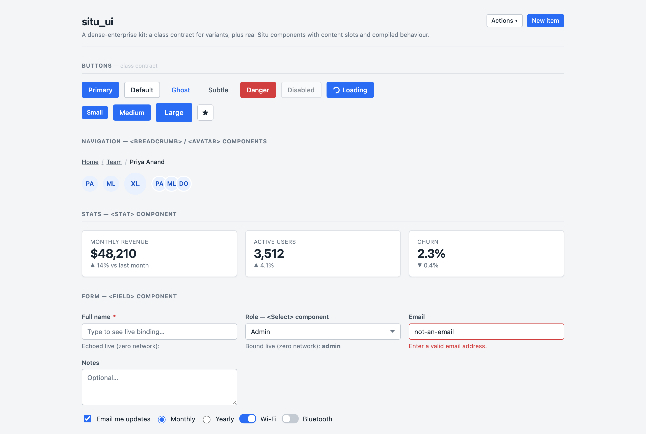
A visual variant (ui-btn--primary, ui-alert--danger, table styling, ui-progress, ui-skeleton) is static presentation — you write the class. Structure, content, and behavior are real components with slots and state. See the Catalog for which is which, and for each component's state mode.
Accessibility
The interaction widgets implement the relevant WAI-ARIA patterns (keyboard menus, combobox listboxes, roving focus, aria-sort, focus restoration) and set all row/option content via textContent — but the kit does not claim full WAI-ARIA conformance certification. <Select> stays a native <select> precisely so the accessible default costs nothing.